iTeaWorld
Project Overview.
iTeaWorld is a local online tea shop offering curated, organic teas rooted in ritual, seasonality, and wellness.
The existing experience made it difficult for users to browse confidently, understand product differences, and trust the brand’s authenticity. The goal was to improve usability and visual clarity without losing the warmth and charm of a small, local shop.
My Role.
UX & UI Designer (Solo) | 3 weeks
Led the project end-to-end, from user research and information architecture to high-fidelity design, visual identity, and usability testing.
Tools: Figma, Maze, Miro, Google Forms
Outcomes
Increased user confidence and trust in brand authenticity
Clearer product discovery and faster browsing
More intuitive end-to-end shopping experience

User Research.
To understand user needs and trust barriers, I conducted:
6 user interviews with frequent tea drinkers and first-time buyers
Usability testing on the existing site
Key User Insights
Users felt overwhelmed by dense product descriptions
Navigation issues (disappearing menus, clutter) caused friction
Trust was tied to clarity, education, and visual cohesion
I synthesized findings using affinity mapping and “I statements,” which helped prioritize simplicity, transparency, and guided discovery.

Persona & Problem.
To anchor decisions, I defined a primary persona based on intent and shopping behavior.
Meet Tia
A ritual-driven tea drinker who chooses teas based on mood, season, and wellness goals.

Problem Statement
Information Architecture.
Problem
Key categories and product information were difficult to scan, making discovery slow and overwhelming.
Design Decisions
Reorganized the sitemap for clearer category hierarchy
Grouped content by intent (ritual, mood, type)
Reduced copy length while preserving educational value
Impact
Users could browse faster, compare teas more easily, and move confidently toward checkout.

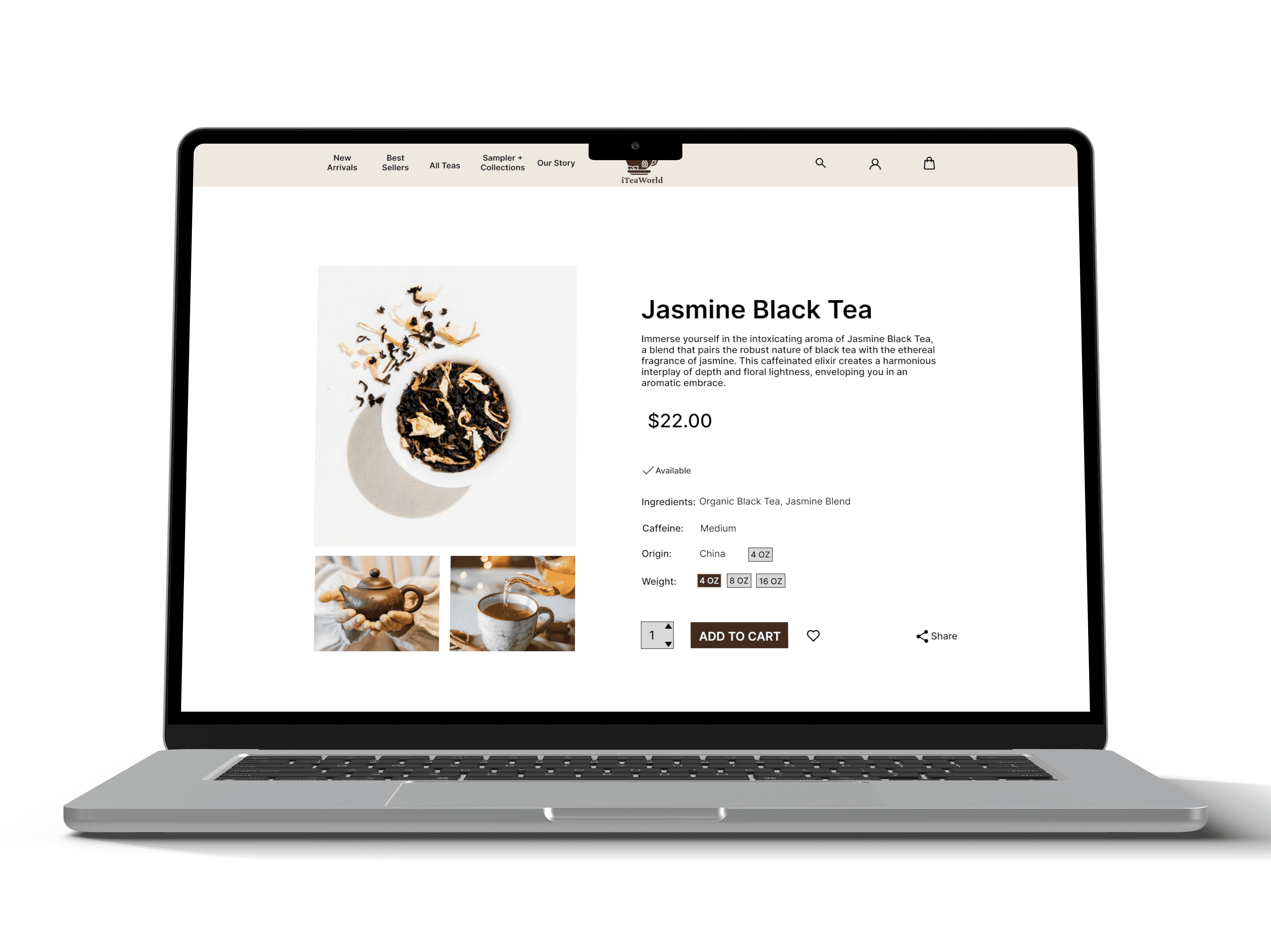
To demonstrate core e-commerce usability, I focused on a critical task flow:
Browse → Product selection → Add to cart → Checkout
This allowed me to validate clarity, ease of navigation, and friction points in the purchasing experience.

Design Process.
I began with low-fidelity wireframes to explore layout and navigation, drawing inspiration from calming, wellness-focused digital experiences. Early concepts prioritized whitespace, hierarchy, and scanability.
These concepts were refined into mid-fidelity wireframes and tested informally to validate structure before moving into visual design.

For the high-fidelity designs, I focused on building trust through warmth and clarity.
Key Design Decisions
Soft, earthy brand colors to evoke calm and ritual
Refined typography to balance education with readability
Custom logo and consistent product imagery to reinforce authenticity
Clean layouts to reduce cognitive load during browsing
The result was a modern yet approachable aesthetic that supported both discovery and credibility.
With the visual system in place, I built a clickable prototype to test real shopping behavior and validate design decisions.
Usability Testing & Feedback.

Usability testing confirmed that the redesigned experience felt smoother, more intuitive, and more trustworthy for both new and returning users.
Improvements Based on Feedback
Simplified product descriptions improved clarity and engagement
Streamlined navigation reduced hesitation and confusion
Cohesive visual identity increased confidence in brand legitimacy
Reflection/Takeaways
This project reinforced that trust in e-commerce comes from clarity, not excess, and strengthened my ability to validate decisions through testing rather than instinct.
Future opportunities: introduce personalized tea recommendations and test long-term retention through ritual-based reordering flows.