Proptech
Collective
Project Overview.
PropTech Collective is a community-powered platform connecting innovators in property technology. The client needed a website refresh that prioritized clarity over complexity, answering three critical questions early:
Who are we? What do we do? Why does it matter?
The lack of clarity was limiting trust, engagement, and content discovery.
My Role.
I led the redesign of the About Us experience and supporting information architecture as part of a 4-person UX team over 4 weeks.
My responsibilities included
Research synthesis and insight framing
Content architecture and page-level UX decisions
High-fidelity design for the About Us page
Usability testing iteration and refinement
Tools: Figma, Miro, Maze
Outcomes
90% of users rated the site higher in trust and credibility
43% increase in homepage comprehension within the first minute
Key content discovered 2× faster

User Research.
To understand where the experience was breaking down, we conducted:
Heuristic evaluation and competitive analysis
10 user interviews via Zoom:
2 PropTech Collective members
6 non-members referred by the client
2 external industry professionals

Key Insights
Users felt excluded by traditional classical formats
Desired social and expressive experiences
Expected a mobile-first, modern design
Valued context and cultural relevance
Design Opportunity: Create a mobile-first app that is inclusive, interactive, and shareable while preserving the Symphony’s elegance and tradition.

Persona & Problem.
To anchor decisions, we synthesized interview findings using affinity mapping and defined a primary persona.
Meet Dave
A 42-year-old founder of a mobile-first facility maintenance app and former construction CMO.

Problem Statement
Information Architecture.
Problem
Resources like newsletters, event links, and reports were scattered across platforms, obscuring the platform’s full value.
Design Decision
I helped design a centralized Resources Hub that grouped content by user intent and embedded third-party tools directly into the site.
Impact
Improved discoverability, reduced friction, and made value immediately visible.

We began with rough sketches focused on clean, modular sections for a more scannable experience. These concepts were refined into low-fidelity wireframes in Figma through team feedback.
The wireframes informed high-fidelity designs that emphasized:
Clear calls to action
Community impact and credibility
Intuitive navigation and content hierarchy


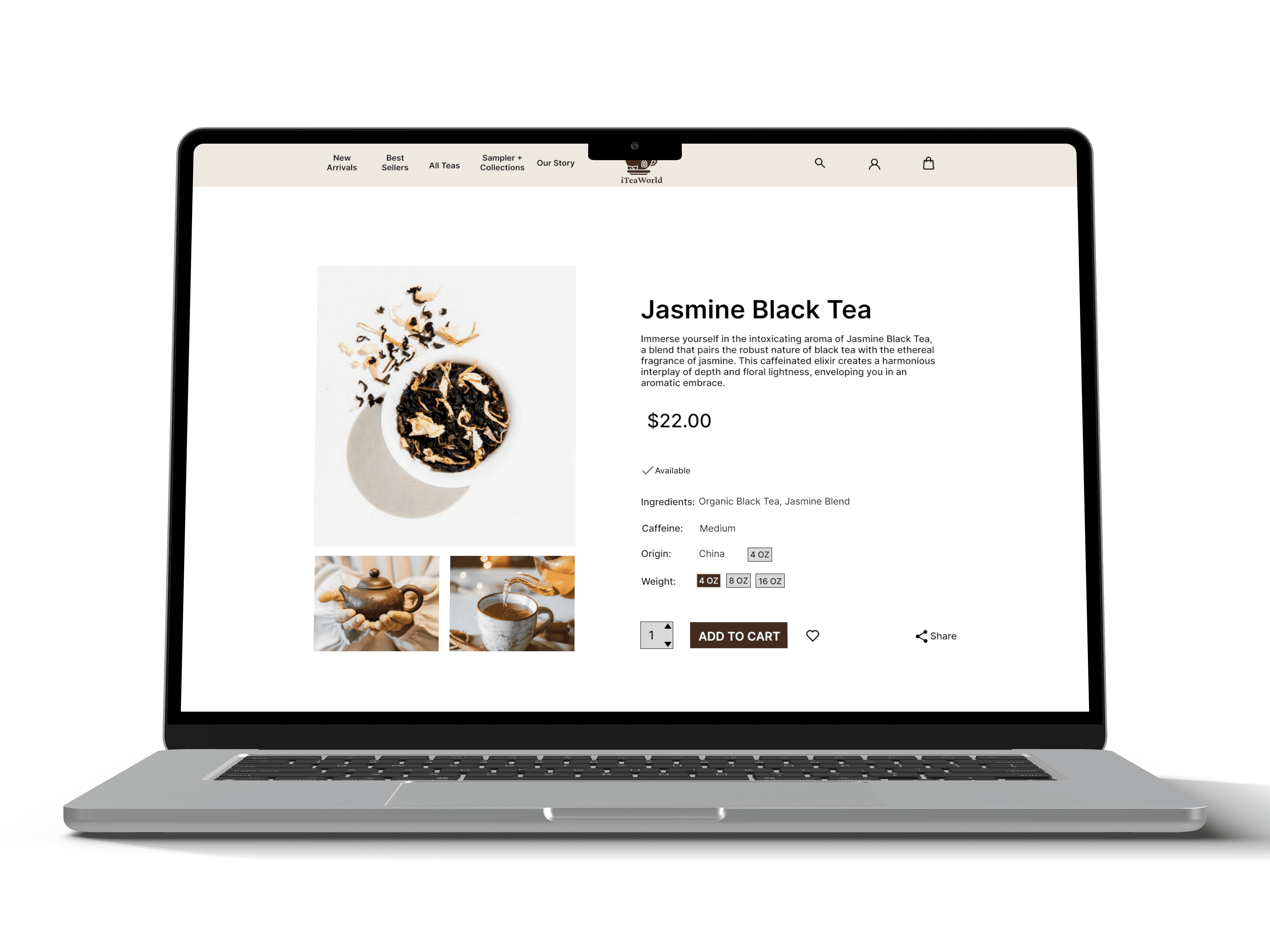
About Us Page (My Focus Area).
For the high-fidelity About Us page, I led the design to clearly communicate PropTech Collective’s story and mission.
Key decisions included:
Reusing homepage iconography for visual consistency
Highlighting the four community chapters with thumbnails and brief descriptions
Adding a prominent “See Upcoming Events” call to action
Reinforcing credibility through a team spotlight aligned with the homepage pattern
This page became a critical entry point for trust and value comprehension.

Our high-fidelity designs brought in visual branding and polish, featuring:
A sticky navigation bar for easier access
A bold hero section with clear messaging
Trust-building stats and quotes
Embedded tools like Beehiiv and Luma
Strong, consistent calls to action
We refined the About and Events pages to highlight community impact and set clear user expectations. The Home page became a compelling brand introduction, while the Resources section centralized reports, newsletters, and insights, anchored by a featured call to action for the 2024 Proptech in Canada Report.

Usability Testing & Feedback.

We ran usability tests with new and experienced users, guiding improvements to visual hierarchy, calls to action, and the Resources Hub, boosting navigation and confidence. The redesign transformed the site from fragmented and confusing to clear, engaging, and easy to manage.
Post-test results
43% increase in homepage comprehension within the first minute
Key content discovered twice as fast
90% of users rated the platform more trustworthy and credible
The client and CEO highlighted that our research uncovered insights they wished had been asked 10 years ago, reinforcing the impact of our work and positioning PropTech Collective for future growth.
Reflection
This project reinforced the importance of leading with value clarity, especially for community-driven platforms. With more time, I would further personalize content discovery for different member types and test long-term engagement patterns.